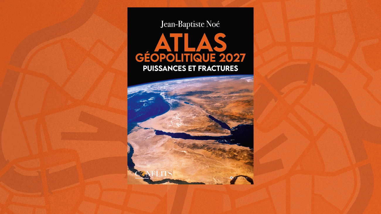

Jean-Baptiste Noé has published a ground-breaking atlas that will leave its mark on geopolitical analysis. It gathers and reorders a selection of the maps published in the magazine Conflits, preceded by a long introduction on what the method of geopolitical analysis actually is. Its author, who edits Conflits, defends an idea rarely shared in a genre reputed to be neutral: an atlas is only worthwhile if it takes sides.
Interview by Mattéo Charton
Atlases of geopolitics fill the bookshops. What justified adding another one?
Jean-Baptiste Noé — When my publisher, with whom I had already brought out several books, suggested the idea of an atlas, my first reaction was to ask what on earth we could add: the booksellers’ tables are covered with them. And then the answer came, and it comes down to a single word: a viewpoint.
Taking maps and publishing them one after another produces an album, not an atlas. An atlas is ordered. There is a way of classifying the maps, of arranging them, and that ordering says something about a line of thought. It reveals what one holds to be central and what one relegates. From there the book became possible, because it became necessary. This atlas is a manifesto: it states what we believe geopolitics to be, how it is analysed and how it is practised.
And yet you keep the arrangement by continents, which is the convention of the genre.
Unsurprisingly, yes: Europe, Asia, the Middle East, Africa, the Americas. It is a very formal and very constrained framework. But that is precisely what interests me about the exercise. Within so rigid a constraint there remains a space of freedom, and that space is our geopolitical vision.
It shows in what we chose to map. At Conflits we keep repeating that geopolitics has nothing to do with commentary on international news, and that it works at several scales. So you will find many maps on France, maps on crime and on the mafias, on businesses and geoeconomics, on culture, on religion. The field covered is far broader than that of the usual atlases.
The other decision concerns the place of France. We put it in every continent. It is the country of thirteen time zones, and we wanted to give material form to that worldwide presence: each continental chapter opens with maps dealing with France within that continent.
Why does the map hold such a central place in the way you work?
Because there is no geopolitics without a map. The word itself contains geography. But the map does two things at once, and that is where the subject becomes interesting. It presents the world to us, and it is at the same time an object that we have constructed.
A map does not fall from the sky. It takes elements, pieces of information, and that information has been sorted and chosen by someone. Every map is therefore already the expression of a human line of thought, of a question, of something one wants to demonstrate. One relies on facts, of course — one does not demonstrate just anything — but within those facts a selection has been made. The map is a discourse in its own right.
So each map tells a story, and the whole tells another?
That is exactly it, and I often think of it through a comparison with the comic strip. Hergé’s albums always follow the same construction, because they first appeared as weekly pages. Each page is independent of the others and tells a story on its own. And those pages placed end to end, one a week, fifty-two a year — which gives all the albums the same format — end up telling another, vaster story.
A map works the same way. It reads on its own, and the set of maps, with the introduction and conclusion that frame them, tells one great story.
Then there is the text. In an atlas the reader looks at the maps — that is the purpose of the book — and the text slips somewhat into the background. That is frustrating for whoever wrote it. But that text puts words to the maps, it explains them, and it is a full part of the demonstration.
Do you see yourself within a lineage?
One always writes in relation to those who came before. The first to publish an atlas of this kind, perhaps the very first, was Gérard Chaliand in 1983, and he overturned the conception one could have of the discipline. Then Alexandre de Marenches published his in 1989, and that is, as far as I know, the first time the word geopolitics was used in the title of an atlas.
What fascinated me about Alexandre de Marenches is the date. He is writing in a world where there is a Soviet Union and a Berlin Wall. He publishes without knowing that the Wall will fall and that the Soviet Union will have vanished three years later.
An atlas therefore always contains a fixed part, which is the presentation of the world as it is at the moment of writing, and an opening onto a great unknown. No one can say what the world will be like in a year, in two years, in three years, and certainly not in ten. It is at once a photograph and what Vidal de la Blache called germs of possibility.
What photograph of the world does this atlas offer?
That of a world polarised around two axes, which I call Chaosland and Technoland. Chaosland starts in Mexico, crosses Central Africa and the Sahel and runs all the way to the Philippines. It is a zone where states are dissolving, with criminal networks and a great deal of violence. Technoland is the China of Shenzhen and Shanghai, it is Silicon Valley, self-driving cars and humanoid robots.
We therefore live in a world where extreme violence and the darkest archaism — voodoo, human sacrifice, the trafficking of human beings — coexist with an unprecedented technological lead. The two are contemporaneous, sometimes a few hours apart by plane.
And France, in this division?
That is the great question of the book, and that is why it is central to it. Will France be swept up by Chaosland, or will it manage to anchor itself to Technoland? There is first a very simple reason for this place: we are French and we live in France. There is another, which is that we did not want a boring atlas, and that a living book speaks of what concerns its reader. But above all it is a reflection on French power. 2027 will be a year of important elections, and the book is also a projection over the coming five years.
Are there things a map cannot say?
Many. We grant the map considerable importance, rightly so, but it comes up against the immaterial. A thought cannot be mapped, or only with difficulty. The map reflects the material and struggles as soon as it is taken out of that register.
The other difficulty troubles me still more, and it has to do with the relationship to space. A vast space is far more visible than a small one. On a map, the countryside takes up a place out of all proportion to the cities, since a city is only a point. Yet that is where most of the population lives, that is where wealth is created, that is where inventiveness lies. There is therefore a permanent distortion between a surface and the usefulness of that surface.
Take the Sahel: millions of square kilometres, and important things happen there. But for the future of the world, what counts is Dubai. In Africa itself, it is Tanger Med, it is Mombasa. Look at a map of the African continent: Tanger Med is not even a pinhead on it, even though the city is fundamental for Africa, while the Sahel takes up all the room. This problem of representation is never entirely solved.
You insist a great deal on the map as a decision-making tool. How does it help in making decisions, in politics as in business?
That is what we call decision-making cartography. On the one hand, the map reveals. It produces apocalypses, in the proper sense of the word, which means revelation. Take a map running from Europe to China: at the centre, Kazakhstan, and one immediately grasps the strategic importance of that country. Take a map of maritime flows: the importance of the Red Sea and the Strait of Malacca leaps out, and with it the fact that an incident in those regions is paid for on a worldwide scale. The map shows obvious things that one had not seen.
« The map is a work of reduction. I set out with the maximum of information to arrive at the essential minimum, and that concision brings a great deal to thought. »
On the other hand, since we have constructed it, it is not neutral and does not impose itself of its own accord. For anyone working on these subjects in a company, the challenge is to manage to construct a map. Not necessarily to master the software: that is a separate trade, ours is done by cartographer geographers. A sheet of white paper and a pencil are enough to make a map.
What counts is the work it imposes. It compels me to put a thought on paper, and therefore to prioritise. It forces me to capture information and, within that information, to sort so as to keep only the essential. It is a little like calligraphy: there is the white and there is the black, the more important is the black, but it is the white that sets it off. Making a good map means capturing an enormous amount of information and discarding just as much. In business one receives a mass of signals, and the whole challenge consists in eliminating 98% of them in order to keep only the two per cent that truly matter. The map is a work of reduction. I set out with the maximum of information to arrive at the essential minimum, and that concision brings a great deal to thought.
You defend paper and pencil in an entirely digitised trade.
We obviously work with every digital tool. But, for my part at least, I hold access to paper and pencil to be essential. First because one goes more slowly, which forces one to think. And then because there is a very powerful link between the hand and the head: as soon as one scribbles, one doodles, thought takes material form and fixes itself.
Draw a country freehand and you stylise it. France becomes a hexagon, the United States becomes a large rectangle with a little piece going off to make Florida. You already have a grasp of space and of sizes, and you are obliged to compose within that space.
The sketch is an excellent exercise, and one learns it very early: there are sketches in the baccalauréat, there are sketches in the preparatory classes where one must accompany a geography essay with a sketch. It is also a language, which forces one to be clear in order to check that one has been understood. One does not err there with impunity, not even over the thickness of a line or the choice of a colour. What is called cartographic semiology, which I am very far from mastering, is precisely that: the choice of colours, of sizes. A language that structures the mind.
And in the end everything turns on two elements: the title and the key. The title is the question — what does this map mean? The key is the information I have kept. To make a map is to be compelled to answer those two questions.
You live among maps every day at Conflits. How has cartographic representation evolved?
Go back to the first atlases, those of the 1980s and 1990s. They were very modern for their time, and today they have something touching about them in their naivety — a naivety that exists, of course, only by comparison with what we do now. What has changed is the mastery of the computer tool, which allows subtleties of representation and typographic choices that were previously out of reach.
But the tool must remain a tool, and that is where the difficulty lies. The computer in a map is like special effects in cinema: it is so marvellous that one puts in a great deal of it, it shows too much, and it becomes indigestible. The right solution, in cinema, is not to see them. They are there, omnipresent, and the viewer must not spot them. That is the work of our cartographers: to use the computer without it showing, so as to keep only the discourse.
I would add one thing close to my heart. We now have maps entirely in colour, and yet black and white retains an extremely strong evocative power. It forces one to be even more concise. One fails a black-and-white map more easily than a colour one, because the thought has to be transcribed into a format where only two values remain. There are none in this atlas, and we could make some. I keep in mind the engravings of Élisée Reclus’s universal geography: everything superfluous has been eliminated, only the essential remains, and yet the landscape is there in full. That is the heart of our work, this work of elimination to keep only what is necessary.